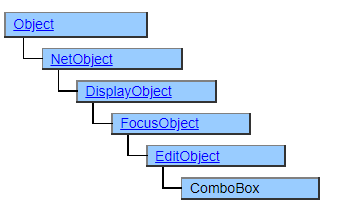
ComboBox Class
A class that displays a combo box. It looks similar to the PulldownList class, but you can type characters from the keyboard as well as select from the options.
The ComboBox class works in tandem with the ComboItem class. To set the data to be displayed as choices, you need to place the ComboItem class or its derived class objects in the structure defined under the ComboBox object.
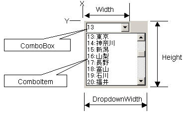
Screen Display Example
Printer output by Doc class
Not subject to printing.
Default properties and ValueType
The default property is Value . ValueType can be String and UString.
Value Type can be specified since Ver.5.0.3
Restrictions when visual style is enabled
Nothing in particular
Precautions when scaling
◆ The apparent height (height that is not pulled down) is not affected by VerticalScale, but is affected by font size changes by FontScale. ◆ The width of the pull-down button is specified by the OS and is not subject to scaling.