FlexTextBox Class
The FlexTextBox class is a class that defines how cells in FlexView are displayed, and the corresponding cells are displayed like a text box.
Place the FlexTextBox object under a FlexRecord object, FlexColumnSet object, or FlexRowSet object.
FlexTextBox cells have a normal state and an edit state.
In the PC version, enter any character key in the cell, press the F2 key, paste operation with CTRL + V, and double-click to enter the editing state.
In the Mobile version, double tap, press the F2 key, or press the Enter key when $ ENTER is not specified in the FlexView.CursorMove property to enter the edit state. Unlike the PC version, it will not be in the edit state when you enter characters.
Since Ver.5.0.0, Unicode input is possible by specifying UString for ValueType.
Screen Display Example
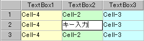
Edit State
In the editing state, the character changes to black on a white background, the character cursor blinks, and you can perform editing operations by key input or mouse.
The edit state has a new input mode and a re-edit mode. If you switch to the edit state by double-clicking the cell or pressing the F2 key, it will be in re-edit mode, otherwise it will be in new input mode. In re-edit mode, the current value is displayed and you can edit it, and the left and right arrow keys move the character cursor. In new input mode, the value before editing is not displayed, and the left and right arrow keys move the cell. Even if you press the F2 key during input, you can switch to re-edit mode, but the contents before editing will not be displayed.
Format specification by Format property is canceled in the editing state and input in the format corresponding to the data type. The character types that can be entered are limited only to the specification of the InputMode property, not by the data type. For example, even in a FlexTextBox of type Number, you can enter “A” or “B” if it is not regulated by InputMode. However, when the input value is confirmed, conversion is performed according to the data type, and invalid characters are invalidated.
Pressing the Enter key, moving the cell cursor, or moving the focus confirms the edited content and returns to the normal state. In addition, the editing state is canceled by pressing the ESC key or scrolling, and the normal state is restored, and the contents being entered are lost.
The entered value can be obtained with the Value property of the FlexCell object, but the Value property changes when the edit state is released. Note that if you reference the Value property in the edited state, you will get the value before entering the edited state. If you need to refer to the value in an event handler that does not release the edited state, such as the Timer event or the Clicked event of the Label class, use the DecideValue method of the Root class. The edit state is forcibly released, and the value being entered is stored in the Value property.
Normal State
Editing operations cannot be performed. The display is similar to a FlexLabel cell, but the cell cursor color specification is ignored and the display color specified for the cell is always maintained. Check the position of the cell cursor with the dotted line displayed around it.
Layout Constraint
FlexTextBox objects cannot be placed to the left (previous in definition order) of objects in the FlexHeader class and its derived classes.
When located as a child of FlexRowSet and FlexColumnSet, it cannot co-exist with objects in the FlexHeader class and its derived classes.
Default properties and ValueType
The default property is Value. ValueType can be String Number, Fixed, Date and UString.
Value Type can be specified since Ver.5.0.0