FlexView Class
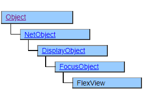
This class is used to display tabular data.
It is similar to the Spread class and ListView class, but it can be grouped according to the contents of the data and displayed like a split merge of cells. In addition, text boxes and buttons can be placed directly in the cells.
The FlexView class, unlike other tabular classes, has no corresponding object for each cell. Like CSVDocument, individual cells are managed as internal data in FlexView and need to be accessed through methods. Even if the number of rows is large, the number of objects generated is small, so you can handle more rows than Spread or ListView.
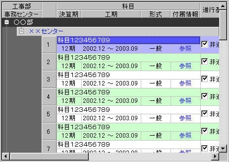
Screen Display Example
Printer output by Doc class
Not subject to printing.
Default properties and ValueType
The default property is RowPosition. The ValueType specification is invalid.
FlexView Overview
The FlexView object is a composite object that does not work by itself, and it uses FlexRecord and FlexItem derived classes placed underneath.
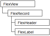
Place one FlexRecord under FlexView. You cannot have multiple FlexRecords or an array of FlexRecords. Note that FlexRecord is an object that defines how a table row is displayed, not an object that represents the row itself.
The following objects derived from FlexItem can be placed under FlexRecord. These objects define the display form of the column and the initial value of the cell, not the object that represents the cell itself.
| Class | Cell accessor class | Description |
|---|---|---|
| FlexRowSet | None | Display the lower FlexItems in multiple lines. |
| FlexColumnSet | None | Display the lower FlexItems in multiple columns. |
| FlexHeader | FlexHeaderCell | Line header |
| FlexGroupHeader | FlexGroupHeaderCell | Grouping line header |
| FlexTreeHeader | FlexTreeHeaderCell | Tree display line header |
| FlexLabel | FlexLabelCell | Display cells like labels |
| FlexIndentLabel | FlexIndentLabelCell | Indent travel |
| FlexButton | FlexButtonCell | Display cells like buttons. It is possible to click. |
| FlexCheckButton | FlexCheckButtonCell | Displays cells like checkboxes. You can change the selection status by clicking. |
| FlexTextBox | FlexTextBoxCell | Display the cell like a text box. Editing by key input is possible. |
| FlexListBox | FlexListBoxCell | Display the cells like a pull-down list. You can change the selection status by clicking. |
The class whose class name is described in the cell accessor class is a class derived from the FlexData class and displays the data corresponding to one column of table data in the cell. Classes marked “None” are not related to table data.
The FlexRowSet and FlexColumnSet classes define the placement of cells and place lower FlexItems in the column or row direction. You can place a derived class of FlexItem at the lower level, and you can make any division by placing multiple FlexRowSet or FlexColumnSet in the lower hierarchy.
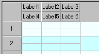
FlexRecord R {
    FlexRowSet Row1 {
        FlexColumnSet Col1 {
            FlexLabel Label1;
            FlexLabel Label2;
            FlexLabel Label3;
        }
        FlexColumnSet Col2 {
            FlexLabel Label4;
            FlexLabel Label5;
            FlexLabel Label6;
        }
    }
}
FlexData and Cell Relationship
The data displayed in the cell is configured by referring to the derived object from the FlexData class placed under the FlexRecord object when the row is generated by the FlexView.InsertRow method etc. and managed as the internal data of the FlexView object.
The value specified for FlexLabel.Value etc. is copied when the cell is configured and maintained as a separate instance from FlexLabel.Value. Therefore, updating the values in individual cells does not affect the FlexLabel object.
FlexItem layout structure
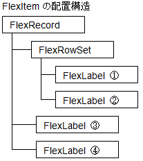
Results displayed by InsertRow
| ① | ③ | ④ |
|---|---|---|
| ② | ||
| | | |
| | | |
In this example, one FlexRowSet and four FlexLabels are placed under FlexRecord. Since FlexRowSet is not derived from the FlexData class, no corresponding cell will be created. Since FlexLabel is a class derived from FlexData, 4 cells (1) to (4) corresponding to 4 FlexLabels are generated.
Some properties such as Value value and FgColor set in FlexLabel are copied to these generated cells and maintained for each cell. Also, other properties such as VerticalAlign and BorderStyle are not copied, they are referenced and shared by all cells.
Note that properties that are not managed on a cell-by-cell basis cannot be changed on a per-cell basis. For example, the display style of the cell border specified by FlexLebel.BorderStyle cannot be changed on a cell-by-cell basis. Which properties are managed on a cell-by-cell basis and which properties are shared depends on the class. Please refer to the document of each class for details.
Accessor Object
Since cells are not objects, it cannot directly manipulate individual cells, but a derived class of the FlexCell class is defined as an accessor to the cell. An accessor is a kind of pointer, and operations on the accessor are transmitted to the cell pointed to by the accessor. For example, if you change the BgColor of FlexLabelCell, the accessor of a cell composed of FlexLabel, the background color of the cell pointed to by FlexLabelCell will change.
Since the accessor is not the cell itself, all operations on the accessor do not affect the cell. For example, you can delete an accessor with the Delete method, but it will not delete the cell. Also, the accessor object is preserved even if the cell pointed to by the accessor is lost, such as with the FlexView.DeleteRow method.
Creation of Accessor
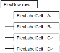
Accessors cannot be generated directly from a script, they are generated as return values for the FlexView.GetRow, FlexView.InsertRow, and FlexView.DeleteRow methods, and as child objects of the FlexRow object that can be obtained as additional data for various events.
FlexRow points to a specific row in the table and has a FlexCell derived object in its child object that has the same name as the FlexData derived object from which the cell originated. Each FlexCell derived object points to the corresponding cell in the row that FlexRow points to.
Example accessor returned by InsertRow
| | | |
|---|---|---|
| A | C | D |
| B | ||
| | | |
var row = FlexView1.InsertRow(1,1);
The structure of the FlexRow returned to row. Row points to the new row you inserted.
When row.A is updated, it will be reflected in the cell corresponding to A.
row.A.BgColor = $RED;
row.C.Value = "123";
| | | |
|---|---|---|
| A | 123 | D |
| B | ||
| | | |
Constraints on Accessor Usage
All accessors must have unique names because they are generated as direct children of FlexRow. On the other hand, FlexItem can be defined with a hierarchy by making it a child of FlexRowSet and FlexColumnSet, but if there are multiple FlexData derived objects with the same name at that time, the object with the same name defined after the second one. You will no longer be able to use the corresponding accessor by name.
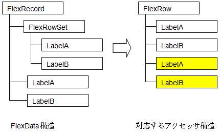
FlexData Structure Corresponding Accessor Structure
In the case of this example, subsequent LabelA and LabelB (yellow part) cannot be operated by name.
If you use the GetColumn and GetHeaderColumn methods provided in FlexRow, you can get FlexCell by position instead of name. When operating LabelA and LabelB after that, it will be
var lb_a = row.GetColumn(2); /* 3列目 LabelA */
var lb_b = row.GetColumn(3); /* 4列目 LabelB */
but if the display position is changed, it will be necessary to correct the program accordingly.
Also, when loading a named CSV, no data will be assigned to subsequent LabelA and LabelB.
Many of these restrictions occur when using the same column name. Try to give each column a unique name whenever possible.
Effective Range of Accessor Usage
Accessors are generated dependent on the FlexRow object that points to the row and work with the internal FlexRow object to actually access the cell. Therefore, the accessor object cannot work if the FlexRow object is lost. Always maintain a FlexRow object while using the accessor.
Constraints on Display Order and Cursor Movement Order
FlexData-derived classes placed under FlexRecord are displayed from left to right and top to bottom in their definition order. Also, the left and right arrow keys move the cursor in the defined order. It cannot be displayed in a different order from the definition order, or the cursor movement order cannot be changed.
Constraints Layout of FlexData-derived Classes
FlexData-derived classes placed under FlexRecord have restrictions on the placement order depending on their type. From left to right, FlexTreeHeader, FlexGroupHeader, FlexHeader, and other FlexData-derived classes should be in that order.
You cannot display the FlexTreeHeader on the far right or the FlexHeader on the left side of the FlexGroupHeader.
Constraints Layout of FlexHeader and Derived Classes
FlexHeader and derived classes cannot co-exist with a class that is not derived from FlexHeader, such as FlexLabel, under FlexRowSet or FlexColumnSet. Header columns always occupy one row.
Constraints Layout of the FlexTreeHeader Class
The FlexTreeHeader class cannot be placed under FlexRowSet. Always occupy one line.
Constraints in Mobile Version
The Mobile version does not implement FlexRowSet, FlexColumnSet, FlexGroupHeader, FlexTreeHeader, and their corresponding FlexCell.
The above classes are available from Mobile Ver.4.5.0
Restrictions when visual style is enabled
◆ FlexItem.TitleBgColor is disabled because it gives priority to the theme display.
◆ FlexButton.BgColor is disabled because it gives priority to the theme display.
Precautions when scaling
◆ When FlexView is enlarged to eliminate the error of the internal effective area at the time of enlargement, it is adjusted to a size slightly smaller than the logically calculated value.
◆ FlexCheckButton checkboxes are not subject to scaling.
◆ The width of the drop-down button of FlexListBox is not subject to scaling.
◆ FlexIndentLabel folding buttons are not scaled.
Table of contents
- FlexButton Class
- FlexButtonCell Class
- FlexCell Class
- FlexCheckButton Class
- FlexCheckButtonCell Class
- FlexColumnSet Class
- FlexData Class
- FlexGroupHeader Class
- FlexGroupHeaderCell Class
- FlexHeader Class
- FlexHeaderCell Class
- FlexIndentLabel Class
- FlexIndentLabelCell Class
- FlexItem Class
- FlexLabel Class
- FlexLabelCell Class
- FlexListBox Class
- FlexListBoxCell Class
- FlexRecord Class
- FlexRow Class
- FlexRowSet Class
- FlexTextBox Class
- FlexTextBoxCell Class
- FlexTreeHeader Class
- FlexTreeHeaderCell Class
- FlexView Class