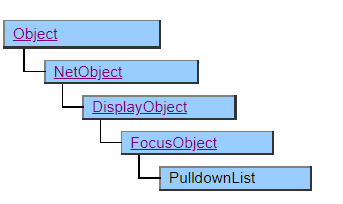
PulldownList Class
This class displays the pull-down list.
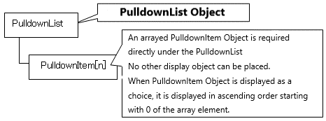
The PulldownList class works in tandem with the PulldownItem class.
To set the data to be displayed as choices, the PulldownItem class or its derived class objects must be placed in the structure defined below the PulldownList object.
Object Structure
Screen Display Example
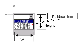
In AI, selection candidates are displayed in full screen. Also, the Height property and DropdownWidth property are ignored.
Printer Output by Doc class
Not subject to printing.
Default properties and ValueType
The default property is Value . The ValueType specification is invalid.
Restrictions when visual style is enabled
◆ BgColor is disabled on Windows Vista and later OS due to OS restrictions.
Precautions when scaling
◆ The apparent height (height not pulled down) is not affected by Vertical Scale, but is affected by the font size change by Font Scale.
◆ The width of the pull-down button is specified by the OS and is not subject to scaling.